Generally speaking, you can't make a great photo from a truly cr4ppy one - just like you can't make great meal with inferior ingredients. And you can't "make data up" - if you start with a tiny, postage stamp picture, you aren't going to get a big, beautiful image. I trust all you took last week's topic to heart and now understand that we will be ONLY working with copies of the originals - and leaving the originals intact - in case we need to go back, change, fix or use for some other purpose.
I am personally using Photoshop CS2 - version 9.0.02. This is at least two versions out of date - but you don't have to have the latest version to do good stuff. You can get a free trial from Adobe, the manufacturer, and they also have scaled down versions - like Photoshop Elements - which will do pretty much everything you need. I don't have that installed - so I can't speak to what it does. Those of you who do, can follow along and post comments about how it differs.
I also use Corel Painter - which I adore - but frankly admit that I don't use it for this. There is other image editing software out there - ranging from equally expensive (Photoshop new is about $700 US) to free. If you are looking for free for Windows - GIMP is a very powerful photo manipulator - ported from Unix - and it's free.
So, I will be talking about Photoshop, but I will try and keep it as generic as possible - so that you can look up how to do the same actions in your own software.
I consider cropping - trimming the photo for composition and to eliminate ugly background elements one of the most important skills you need - but I seldom do it first - so I'm going to leave it for later.
Today - we're going to start with "Levels" - and just cover about half of it - as it was a busy weekend and promising to be a busier week, and I'm short of time this morning. ;-)
Using "Levels" lets you see and adjust the tonal range (light and dark) (and the colour balance) of your image by giving you control over the distribution of light and dark pixels in the image. This roughly breaks down into shadows, highlights, and midtone ranges. We'll be using a "histogram" to visualize this data - much like a graphic equalizer allows you to visualize sound data for balancing sounds.
A histogram literally is a graph - showing the number of pixels in the image that are at that specific intensity level.
So let's take a look. Open a photo in PS (Photoshop) (or your choice of software) and access the levels by selecting Images, Adjustments, Levels... or by pressing Control + L (press down and hold the key labeled "Ctrl" and then tap the "L" key.)
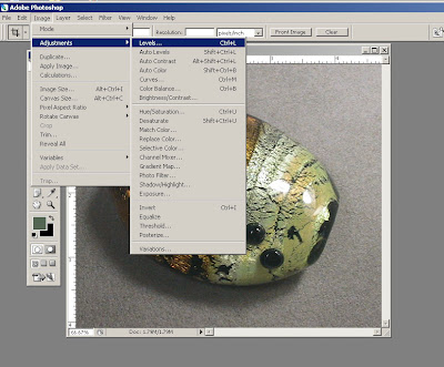
This will give you the Levels dialogue box, and show you the histogram for that picture. (I can't begin to describe how freaky it is to be manipulating image of my computer screen. It is totally confusing. I keep clicking on images to close boxes.)
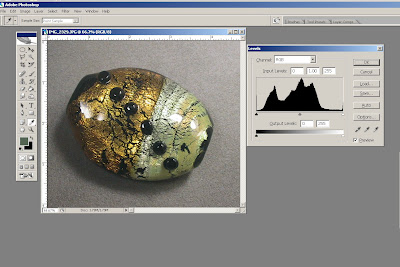 Let's zoom in and look at that closer. See the histogram - and you can see how this is a graph.
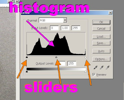 From the left, there are a few pixels in black and dark shades in the image, so the graph starts out low, more pixels in the mid-ranges - so the curve goes up like a mountain, and some, a few, in the light tones and highlights. Ideally, a histogram is more or less like this, like a bell curve or a mountain range. What is should not be is a big freaky spike in the middle - or one end or the other, and nothing down on the plains. That tells you that you aren't getting a good range of data when you take your pictures. Sometimes, it's unavoidable - but if you get it all the time - you need to re-think your photography set up.
The black, grey and white triangles that I labeled "sliders" show where that data is - shadow, midtone and highlight. You can manipulate the darkness and lightness of your image by sliding those back and and forth - left and right. To do this - click on the triangle with your mouse and drag it to the side.
Like so.
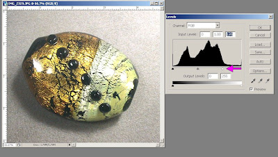 For this one, I dragged the white triangle to the left, and everything got lighter.
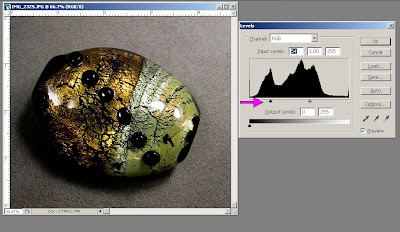 For this, I dragged the black triangle to the right, and everything got darker.
Yes - there are OTHER ways to do this (changing the brightness/contrast - Image, Adjustments, Brightness/Contrast) - but it's good to have multiple ways to do the same thing - and this gives you finer control. And there are other things you can do in this dialogue box too.
Let's look at some less well balanced photos and see this in action a little better.
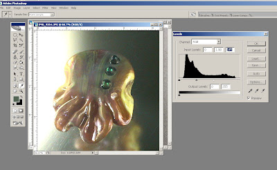
 This picture is dark and gloomy. But by sliding the white triangle to the left - the entire image has brightened - colours are revealed - and the bead looks much better.
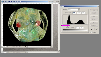
This sculptural bead is all washed out and too light - making it hard to see any detail.

Sliding the black triangle to the right brings up the detail and makes it much more interesting. The background drops away to all black - but that is a good thing for this picture.
 Again - a light bead on dark background. And just look at that histogram - blech! Lots of black - a few midtones - where the heck are the highlights?
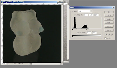 White triangle to the right, and now we have some shadows, highlights and some definition to the image.
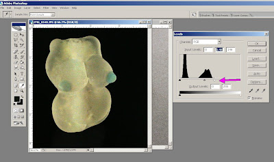
Experiment with this - and you can also slide the grey triangle in the middle from side to side for different results too. When you get a result you like - click on ok and save your image. If you mess it up beyond recognition - click on cancel. Or click on auto to have PS take it's best guess at what it should be. You might like the results, you might not.
Play with this for a bit - we'll carry on next week. Now that you have a rough idea of what the controls do and why - stop worrying about it and just play and go for a result that you like!
Next week - we'll tackle those little eye-dropper dealies in the bottom right of the box and see what they do!

No comments:
Post a Comment