Most of the photography that we are doing is, as we discussed earlier, macro photography. With macro photography - you don't usually have the option to zoom in and out to change the composition - and so you move yourself in and out from the subject to crop. But - that can be hard on the back - and so often - you shoot everything from the same distance. Now you just want to trim off the excess so that you don't have your subject lost, floating in a sea of grey.
You might also have a picture that you really like because the angle was great, the focus perfect, etc., but you also captured the edge of the stage, or your fingers or some such. Or - it was the only one you took before you gave the item away. Pfui on you for ignoring my advice about that! ;-)

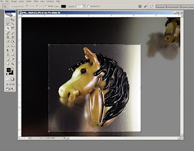
 To crop in PhotoShop - look for this tool - the crop tool. Every picture editing program will have a way to crop the image - or it's not worth hard drive space.
Click in the top left of where you want to trim to, and then drag to the bottom right, and release. You will have a marquee bounding box (the marching-ants line around the image) - and the part that will be trimmed away will be greyed out and look darker. You can adjust those edges - move your cursor over one of the little hollow boxes on the marquee line and it will change to a double-headed arrow. Click and drag to adjust the line location. When you like what you have - double click inside the box and it will crop. (If you want to cancel the operation without cropping - press the "Esc" - escape - key.) Now - save your image. You are working with a copy of your original, right?
Let's look at some examples.
Here we have one of my pony beads - you can see a reflection in the top right of the next one, waiting to be photo'd, the edge of the stage in the top and bottom left, and - oh nice! - a reflection of me taking the picture. Very professional.

So - trimming the edges away - those distractions go away and now you have a picture that focuses on the bead - and even though you can see the photographer's reflection - it is now merely a colorful blur that looks like it might have been purposeful.
 Here we have practically the same scenario - the next bead peeking in from the top right.
Crop, double-click and voila - distraction gone!
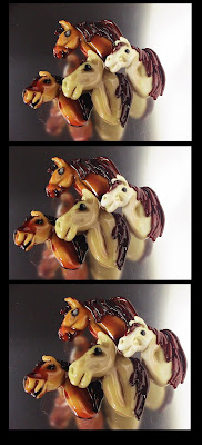
 Now here we have a grouping of ponies - and you can see that the overall composition isn't bad - no obvious distractions, but could be a little tighter - less excess space around them.
In the second version - the image can been cropped, but cropped badly - cutting up close to the noses and leaving excess space on the right.
In the third version - the cropping is better, close on the right and leaving more room on the nose side of the picture.

I like to think of leaving some "breathing room" or "room to move" in the image. Generally - here in the western world, we are taught to read from left to right, and so we read our images from the left to the right as an extension of that. These pony beads are made to be read from the left to the right (when you view them) as the face will be on the left and that is the important part.
If they were made to face the other way - you would be looking at the mane first - not the most significant part of the face. So you see the nose - your eye travels up to the pony's eyes, moves right, looks at the mane, follows the curve of the mane down and keeps going around that curve back up to the nose and around again to the eyes for another look. Very clever, yes?
 But when you look at the second version (here it is again) - it jangles - because those poor ponies are jammed right up against the edge of the image. They aren't actually touching it - but it feels wrong because they are so close and there is so much space behind. So while I would NORMALLY put the extra space on the right - if I thought a picture needed it - this is the exception that proves the rule. The third version - with the extra space on the left - at the nose side - looks better.
Once you start cropping pictures - you have to starting thinking about composition - which leads us to the story you are telling - what do you want to say? - and who are you saying it too?
Let's look at another. This is the original, uncropped picture. Not inherently awful - but too much extra space around the necklace.
 That's a slate roofing tile for the background - in case you were wondering. It makes a lovely background.
So this version is cropped to show the entire item. Very appropriate for showing the entire necklace and showing the focal bead, the strands and the clasp.
 This version is cropped tighter - you can no longer see the entire image - but you can infer the rest. This puts the emphasis on the focal bead and the colour of the beaded strands. This piques the interest, and would work well as part of a series of photos of the item in question.
Don't be afraid to crop your image so tight that some of it bleeds off the side of the image - especially if you are presenting multiple photos - so that overall - your viewer gets to see the entire piece.
This image was shot close to show the beautiful patterning on the surface of the bead.
 But by trimming it even closer, and eliminating the extra space on the right - it does that even better now.
One more example. A wave bead on a slate tile. Lots of extra space.
 Cropped tight - really shows off the bead.
 Cropped a little looser - with extra space of the right - seems to have a little more context - perhaps evokes waves crashing on rock just a little. Neither cropping option is wrong - just more appropriate in some situations than others.
I tend to deliberatly leave space around the image when I shoot it so that I have options in cropping when it comes time to use the image.
 Composition can be a difficult topic to get your head around it you don't have a natural flair for it. It is quite learn-able though - it's not a dark art. Try and pay attention to the order you see things in an image. Where does your eye go - from where to where to where? Or do you just get confused and can't figure out what to look at first? That would be an example of poor composition. Do you overlook some important detail? Perhaps changing the cropping will change that?
Do try different cropping options with your images to get a feel for what works. Make multiple copies of your images and try cropping them to different extremes. Try long skinny pictures, try cutting off one side. Try leaving a lot of space on the top or bottom. Then compare the results and see what sort-of works and what doesn't - and then go from there.
Often, you also have to work within the constraints of where you are using the image - i.e. a website that only uses square images. Next week - I'll show you a neat trick in Photoshop for handling that particular dilemma.
No comments:
Post a Comment